

How To Fix Mobile Usability Issues In WordPress
Summary: This article will teach you how to resolve mobile usability issues on your WordPress site. We’ll cover how to check for these issues in Google Search Console and how to fix the most common errors that arise.
Mobile devices account for over 50% of the total global web traffic.
With stats like these, it’s no wonder that most business owners go the extra mile to ensure their websites are optimised for mobile.
Since most websites on the internet are built using WordPress, ideally, you’d think most sites using the CMS are mobile-optimised with no usability issues, but that is far from the truth.
A lot of WordPress theme developers neglect to optimise their theme for mobile. In fact, many pre-made themes have terrible mobile experiences.
So, in most cases, you’d have to fix up all mobile usability-related issues yourself or hire a WordPress developer. Luckily for you, though, I’ve cooked up this handy little guide on how to fix mobile usability issues in your WordPress site.
But before that, let’s discuss mobile usability and its importance.
The Importance of Mobile Usability
As we mentioned above, mobile traffic is dominating the internet.
Imagine losing at least half of your potential clients because of mobile usability issues. That’s how crucial mobile usability is.
Big brands like Youtube and Amazon invest millions yearly into ensuring their platforms are supercharged for mobile users. They even go as far as offering mobile-specific features to improve retention time and positive user experience.
With so much online competition, a site that is unoptimised for mobile will naturally limit its potential to grow or dominate – especially regarding aspects like SEO.
Google made it clear that sites optimised for mobile will consistently outperform those that aren’t when they released their mobile-friendliness update in mid-March 2016. So if your website has any mobile usability issues, it can affect your SERP rankings and the overall reach of your content in other search engines.
Luckily, Google also launched the Mobile-Friendly test, which can help detect and fix mobile usability issues on any website.
This test was also integrated into the Google search console in recent years to simplify the fixing of mobile usability-related issues.
Now, let’s look at how this Google usability test tool works on both the standalone and search console versions.
How to check for mobile usability issues
Google’s Mobile-Friendly Test (Standalone Version)

To access this tool, navigate to “https://search.google.com/test/mobile-friendly“, and you should see the landing page in the screenshot above.
Using this tool is quite simple. Enter the URL of your website – it could be the homepage, specific pages, or a blog post.
For example, I’m going to enter “Google.com” (let’s see if they practise what they preach.)

As you can see, “google.com” passed with flying colours – if any URL on your website isn’t resulting in “Page is usable on mobile”, then the test tool will show you the issues for the page.
Now let’s try another example.

From the screenshot, you can see that the website URL I entered has two mobile usability issues – Text too small to read and Clickable elements too close together. To get insights on how to fix either of these issues, just click on them, and a section will pop up on the right with a screenshot of the problem.
Once you fix the mobile usability issue, the test tool will stop displaying the error.
Google Search Console’s Mobile Usability Report

When you add a website to Google’s Search Console, you get a personalised version of the test tool that automatically monitors and reports mobile usability errors.
The screenshot above is from an active site with 84 mobile usable pages and 31 pages with issues.

When you scroll down, you’ll see a section categorising all the pages based on their errors. By clicking through any of these listed errors, you get a list of all the affected URLs.

By clicking on any of the URLs, you get to see all the mobile usability errors related to it and how to fix them.

Aside from the Google mobile usability tool, there are other third-party tools that can help you detect and fix mobile usability issues. Still, I recommend using Google’s tool over anything else – it’s that powerful.
Now, let’s look at all the common mobile usability issues your WordPress website might have and how to fix them.
Common Issues & How to Fix Them
Error #1: Text too small to read
Mobile devices have a limited viewport to display webpages, so it’s typical for some page content to become harder to read when rendered.
The “Text too small to read” mobile usability error is triggered when any text on a webpage is below 16px in font size.
Everything from the text on the navigation menu to the main content should be at least 16 pixels in font size to be considered mobile-readable.
Fixing this error for WordPress requires you to switch to the mobile version of the affected URL and increase the size of any text to less than 16px.
If you use a pagebuilder like Elementor, you have to switch to the mobile breakpoint via the editor and increase the font size of any text that isn’t readable.

Note: All popular WordPress pagebuilders have this breakpoint feature that allows you to define font sizes for the mobile version of your pages.
If you’re using a custom WordPress theme without a pagebuilder, then your best bet would be to use some mobile-specific CSS. Media queries, to be precise.
For example, if the Google mobile usability test tool detects that the font size of paragraphs on a page is too small read for mobile, a CSS code snippet like this should fix it:
@media only screen and (max-width: 600px) {

p {
Font-size: 16px;
}

}Whatever CSS code you write between the media query opening and closing parenthesis will only become active for screens below 600px. This allows you to add CSS code that changes in response to the size of the device screen.
If there’s any other text on the page triggering the “Text too small to read” issue on the page, all you have to do is find its selector and add it to the media query block.
As for how you add this to WordPress, you can achieve that via the customiser. Navigate to the customiser settings under appearance located on the WordPress dashboard navigation and select the “Additional CSS” tab.

Just paste in the CSS code, and it should apply across all the pages of your site. If you want to apply the CSS code to only the affected page, then you can use a plugin like WP Add Custom CSS.
The best part about fixing the “text too small to read” issue with CSS is it doesn’t matter what your WordPress site is built with, CSS overrides everything from page builders to theme defaults.
Error #2: Clickable elements too close together
Since mobile devices have a small viewport to work with, it’s very easy for elements on a page to get crammed up when stacking.
The “Clickable Elements too close together” mobile usability issue is triggered when you have one or more elements closely packed together.

As seen in the image above, this usability issue makes it impossible for users to click on a specific element on mobile accurately.
The easiest way to fix issues of this nature is by adding enough spacing between each element. A margin, to be precise.
If you’re using a WordPress pagebuilder like Elementor, applying this fix should be easy – switch to the mobile breakpoint on the editor and add margins between each element.
The best bet for traditional WordPress theme users would be some good ol’ CSS styling.
If you’re not comfortable using CSS, you might need a developer to help out since there’s no magical CSS code that can fix this issue for every scenario.
In the example screenshot above, each button has a class name of “btn-buy”, so writing the appropriate CSS code to fix the issue on mobile should be easy.
Just like when we were fixing the first issue, we’re going to rely on media queries again to limit the CSS code’s effect to mobile only.
@media only screen and (max-width: 600px) {

.btn-buy {
margin-bottom: 10px;
}

}The code snippet above adds a margin spacing of 10px to every button on the page for mobile devices, which fixes the issue entirely in this scenario.

If, in your case, the elements are side by side, then you might have to use CSS properties like margin-right and margin-left.
The most important thing to know when fixing the “Clickable elements too close together” is the CSS selectors of the affected elements. Once you figure that bit out, all that’s left is just writing some simple margin-related CSS code.
Error #3: Content wider than the screen
This usability error is triggered when any element (text, image, video, etc.) has a width value that exceeds the viewport width of a mobile device.
You can even notice this issue visually on a mobile device, as it usually triggers a horizontal scrollbar for mobile users.
To fix the “Content wider than the screen” error on WordPress, use the Google mobile usability test tool to detect the specific element with an excessive width value, then use CSS to correct it.

In the above example, it’s easy to see that the image present on the page spans a width higher than the available Viewport of the mobile device.
To fix this, we have to use media queries to apply more responsiveness for the image – Percentages or VW (View Width) would do.
Here’s the CSS code snippet:
@media only screen and (max-width: 600px) {

img {
Width: 100%;
}

}What the CSS snippet above does is force the image on the page to always span 100% of its container’s width – this prevents the image from going beyond the boundaries of the Viewport.

You can also use 100VW, which does almost the same thing as a percentage, except it takes up the entire display width of any screen size, irrespective of the parent container’s set width.
Since the “Content wider than the screen” mobile usability issue is mostly width related, in most cases, you’ll be resetting the maximum width of containers, images and other elements that tend to take up huge spaces.
Another way to avoid the error is to avoid using pixels and opt for more responsive measuring units like percentages and view width.
Error #4: Viewport not set [to “device-width”]
When a browser loads up a page, one of the first things it does while rendering HTML is check for meta tags – tags that hold essential information about the page.
One of the most critical meta tags browsers check for is the viewport meta tag which helps them define the page’s dimension and scaling based on screen size.
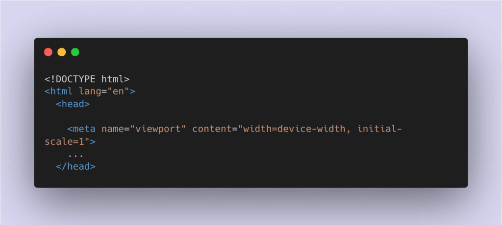
This code is to be added in the head tags of every page and, if neglected, can trigger the “Viewport not set” mobile usability error.
Not setting this tag might not necessarily affect how your page is displayed on mobile and other devices (CSS can make up for that), but it’s a tag search engines like Google take very seriously.
To fix the Viewport not set issue for your WordPress site, you must add this simple one-line to the head tag of every page.
<meta name=”viewport” content=”width=device-width, initial-scale=1″>
Luckily, this isn’t a common issue for WordPress users since every theme includes this meta tag by default.
Error #5: Uses incompatible plugins
This error is triggered when the Google usability test tool detects any old web technology on your website, i.e. Flash.
Since web technologies like Flash have been phased out from the web, continually using it can deliver a bad experience for your users, especially on mobile.
The only way to fix the “Uses incompatible plugins” mobile usability issue on WordPress is by removing all instances of Flash or any outdated web technology.
Final Note
In conclusion, mobile usability is critical to the success of any website in today’s digital world.
With more than half of all global web traffic coming from mobile devices, making sure your website is optimised for mobile is essential. Luckily, Google has made it easier to fix any mobile usability issues with its Mobile-Friendly test and its integration into the Google Search Console.
By using these tools, you can ensure that your website is accessible to all mobile users and can perform at its best in search engines. And if you’re using WordPress, you’ll want to ensure your theme is optimised for mobile or take the necessary steps to fix any issues.
Don’t let a poor mobile experience prevent you from reaching your full potential online.
More WordPress Guides For You
Book a 30-min Introduction Call
Let's jump on a quick intro call We'll break down your project, and pinpoint exactly how we can help.


Our clients  Holaa! love working with us see their stories below!
Holaa!


